
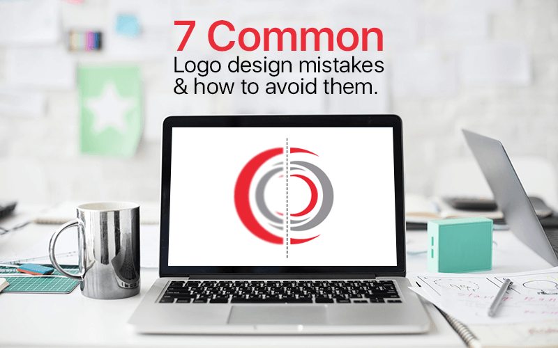
7 Common Logo Design Mistakes & How to Avoid Them
Logo designing is nothing but an art that is moving ahead day by day, for that reason designers must remain updated with the dos and don’ts to become more expert at their work and to distinguish from others in excellence in the competitive market. They also need to avoid making the mistakes. By doing so, they will soon make a perfect design.
Here are the following not-to-do things or slip-ups:
Not Keeping an Eye on the Design Brief
Keep this in your mind that you’re designing for your client which means you’ve no chance of conjectures. Go through design brief very carefully and precisely. Still, if you find any problem with any aspect of design, ask your client. There’s nothing to ashamed of asking about the project.
Your Logo is Not Only One of Its Kind
Uniqueness is the only aspect which you’ve no chance to make any compromise with it. The logo is like a face of business. It means, it should be unique and different. Logos that are copied, unoriginal do not get much attention. Therefore, copying is never a good idea. If you’re thinking your present logo is not unique or even it looks like copied, it is time to take a serious action --- reform it or get a new one.
Be Dependent on Trends
Trends are changing. Relying on one pattern is not rational or sensible when it comes to logo design. Instead, focus on timelessness and simplicity of design. An excellent logo should be meek and everlasting. By this, it means it should be interactive not only for the people of today but also for the people of tomorrow. So, go for common elements or fashion which you think will never change or at least functional for an extended period.
Using too Many Fonts
Most of the designers think that using too much font can make the logo more appealing. It is not. You should have to avoid using more than two types of font in one design. Study every font’s persona and relate to your design or business. See which font should be used and pick the correct one for your customer’ logo.
It’s Not Simple
Intended to be the "face" of a company, the logo represents your business and allows customers to identify the company's core message. The simpler the logo is, the more clearly it will describe your business’ persona and deliver its message. Making logo complex with intricate fonts, heavy ornamentations and multiple shades of colors is the worst thing you’re doing with your business. In fact, a simple logo is cognitively easy to remember, easy to understand and soothing to perceive. It gets enough attention.
Not Using the Right Software
Using tools that are not appropriate or complicated is a big mistake. I would personally suggest you do not use Photoshop. Instead, use Corel Draw and Adobe Illustrator to craft your logo.
Ignoring Feedback, Reviews, Opinions of Clients
Feedbacks are significant which help you to learn and deal with faintness. Being a designer, pay careful attention to your client’s response. Don’t take his criticism negatively, take it positively and try to learn. Be very careful when you’re reading the feedback your client providing on the project.
We all make mistakes. But, we need to recognize our mistakes and their reasons. In this way, we don’t repeat same mistakes. The errors which I’ve mentioned above should be avoided to make logo competitive and good enough in the market.

0 comment(s)
Leave Your Comments